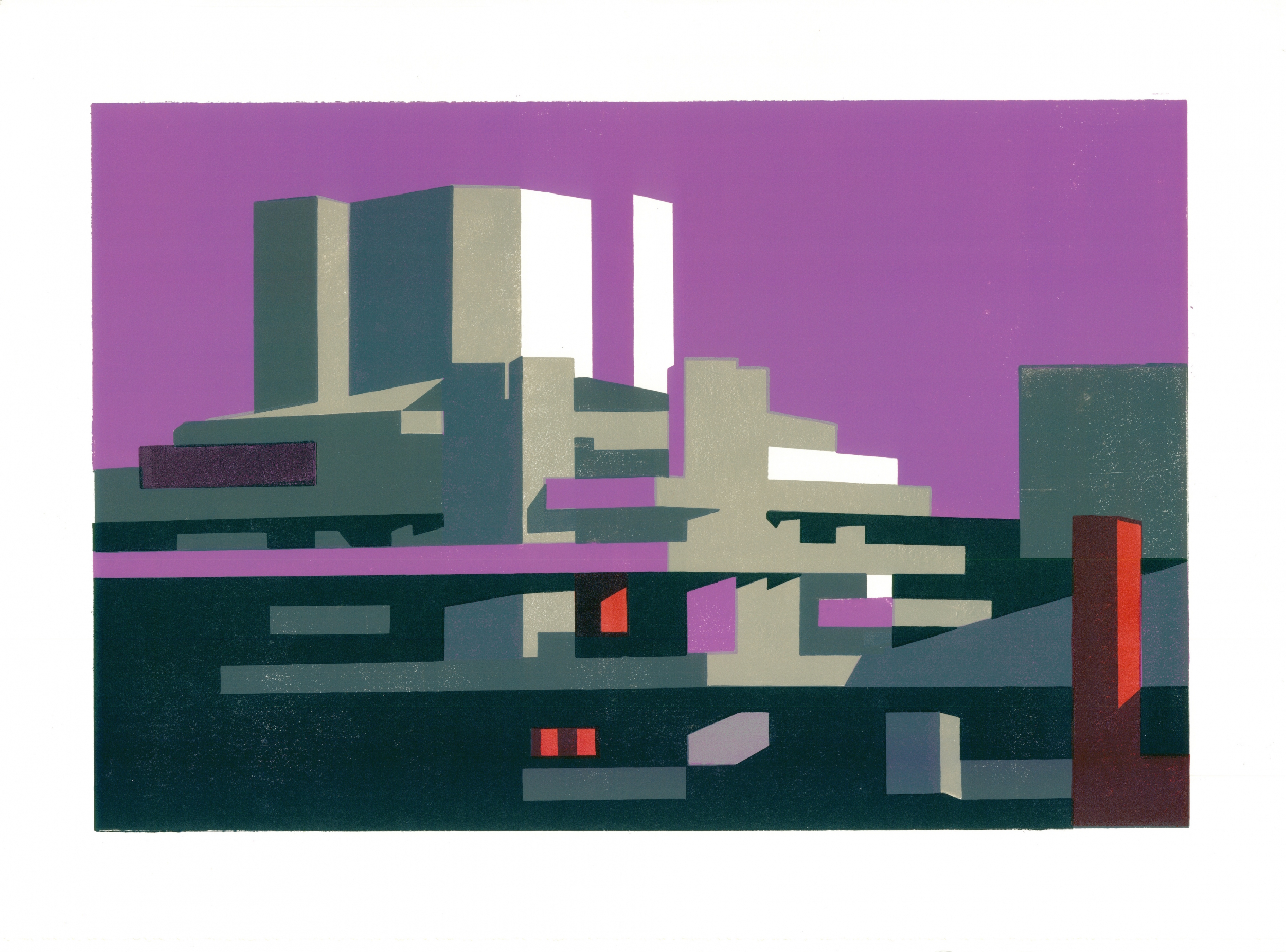
RIBA Journal – Poster boy Paul Catherall’s Brutalist ‘potato prints’
By Pamela Buxton
Searching out the spare lines of brutalism and modernism: interview with artist and printmaker Paul Catherall.
‘Basically it’s a sophisticated potato-cut,’ says illustrator Paul Catherall rather self-depreciatingly of his distinctive linocut printing technique. For nearly 20 years, Catherall has been capturing architectural landmarks in his strikingly graphic style. Each design is a hugely labour-intensive process – a set of hand-printed editions of a single design can take up to six weeks to produce.
His work has had wide appeal, leading to posters for London Transport, the South Bank Centre and British Airways as well as numerous book cover and illustration commissions. His latest exhibition opens this month at Eames Fine Art and is the first to concentrate on his depictions of brutalist and modernist architecture.
It’s a surprise to learn that this painstaking way of working is the antithesis to how Catherall worked for many years, both at and after college. He actually started out as a figurative illustrator, working in a swiftly-executed reportage style.
‘Anything that took over 10 minutes was too long for me,’ he says. It’s certainly very different now.
‘I like the process of printing where the image slowly evolves – you get so involved in it. It’s such a slow process, and would have driven me mad before.’
Hayward III, a linocut by Paul Catherall. This image is one of the illustrator’s more abstracted and multi-coloured designs.
He can trace his conversion to the slow pace of architectural linocuts to a visit to San Francisco. Here he first encountered the work of graphic artist Michael Schwab, who created three-colour screen prints of landmarks such as the Golden Gate Bridge. Catherall decided to turn his hand to illustrating London’s landmarks, including some of the Millennium projects then under way. He found himself drawn to concrete brutalist architecture in particular, whose shadows and textures lend themselves so well to printmaking. Architectural linocuts have been an obsession ever since as he attempts, he says, to create his own visual identity of the capital. In doing so, he also draws on the work of mid 20th century poster designers such as Tom Eckersley and Edward Wadsworth as well as the abstract landscapes of Paul Cézanne.
He puts down his fondness for the concrete of the South Bank and the National Theatre in particular to his upbringing in Coventry, where concrete was prominent in the city’s post-war reconstruction. The Barbican, Elephant & Castle Shopping Centre, Nine Elms Cold Store and Tate Modern were similarly appealing.
Barbican Grey and Barbican Lime by Paul Catherall. With its various colourways, each hand-printed design can take up to six weeks from initial sketch to completed series of prints.
‘I felt quite at home. I found them quite welcoming and felt a certain nostalgia, perhaps linked to my childhood,’ he said.
His process is to sketch each building in strong daylight and photograph it, then crop and draw the building on laying-out paper. This drawing is refined between 20 to 50 times to capture both the essence of the building and an image that will work well as a linocut. This results in varied degrees of abstraction.
‘It’s always simplified, always about getting it down to something that will work as a design, using a little bit of artistic license and boiling it down to its essence,’ he says. ‘Less is more. One little thing out of place and it won’t work.’
Some buildings prove rather more straightforward as subjects than others. While the composition of the National Theatre has, he says, done half the work for him, others such as Trellick or Balfron Tower take a lot more time of ‘messing around with perspective and flattening out’ to make them work for his purposes.
He prints in relief in his shared printmaking studio near Brixton, building up the image plate by plate in a careful sequence using typically four or five often punchy colours but sometimes many more for his more complex images.
His choice of colour is intuitive – certain buildings immediately suggest specific background or highlight colours to him.
‘Basically I love concrete, and I’m always thinking of ways that the particular concrete can be enhanced. For Trellick I couldn’t get away from using light grey or an aqua blue.’
And while he’d like to think that he isn’t too much of a concrete anorak, Catherall certainly finds particular buildings addictive, returning to some such as the BT Tower and Battersea Power Station again and again to make further refinements to his image.
Catherall is certainly happy to have found his niche and has by no means exhausted his subject matter. Not all buildings suit the medium – monolithic Brutalist slab blocks don’t work so well – but he has his eye on tackling Richard Seifert’s Space House on Kingsway and also Patrick Hodgkinson’s Brunswick Centre in Bloomsbury, among many. And fittingly, he would love some day to capture the concrete heritage of Coventry, which after all helped set him off on the aesthetic path he’s on today.
Paul Catherall Brutalism | Modernism, 9 November – 3 December 2017, Eames Fine Art, 58 Bermondsey Street, London SE1 3UD
See full interview at RIBA J

